|
|
| Your average overworked and underpaid script reader slaving away in some Hollywood hotshot’s Century City office is just looking for an excuse - any excuse - to tear your submission apart. And nothing will make that screenplay contest judge's temper enflame more than a poorly formatted or shoddily presented script. Thus to save you the embarrassment of such a shredding, the recommended Hollywood standards for formatting a feature length motion picture screenplay are below: |
| 1] MATERIALS: | Paper – U.S. Letter or die! Hollywood does not do metric; so keep that A4 away from American airspace. 8 1/2" X 11" plain white 20 lbs stock (i.e. US Letter) with no watermarks. Covers -- Card stock (80-120lbs) should be used on the front and back of the script to provide protection. Once again 8 1/2" X 11" US Letter size only. Avoid adding any logos, illustrations, etc… The cover should be solid a color, but plain. No fancy rag stock. Cream or Ivory should do the trick. Binding -- Two solid brass paper fasteners (1 1/4") a.k.a ‘brads’ should be used to bind the script. Avoid the flimsy Staples kind. 3-Hole-punched -- Covers and Pages should be three hole punched. Fasteners should be placed in the top and bottom holes with the center hole left empty. Guru's Tip: Once bound, gently pound the fasteners on the head with a hammer or hard object - I’ve found a baseball works quite well - to tighten script. Note: Hollywood Script Express has you covered, providing all the recommended materials! |
| 2] FONT: | “COURIER” (typewriter) font 12pt is the one and only font you should use. Use "old" if at all possible but "Courier New” will do in a pinch. You are a screenwriter not a layout artist, so no kerning the letters or fudging on the line spacing. 12 pt only! |
| 3] TITLE PAGE: | The less the better with title pages. Just start down from the top about a quarter of the page and center your screenplay title, either in all caps or surrounded by quotation marks. Double space two lines below and add the words “written by” and of course… your name. In the bottom right corner add your contact information, including your address, phone and e-mail. If you have a WGA registration number or US Copyright PAU number, then it is a good idea to put it down here. Try to avoid adding any specific dates or draft numbers to your Title pages as it might make the reader think your material has been around the block a few times… And everyone in Hollywood is looking for a virgin…err, material that is. Also as noted above, resist the urge to add any graphics or logos. For an example of a stellar Title Page click here. 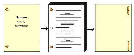 If you are entering screenplay contests via Withoutabox.com please be sure to put your entry tracking number on your coverpage! |
| 4] LENGTH: | The general rule of thumb in the biz is: 1 script page = 1 minute of screen time. Thus it is advisable to avoid submitting scripts longer than 120 pages or shorter than 90 pages. Obviously films over two hours do get made all the time, but Guru's advice for new writers who are trying to get their foot in Hollywood’s door is to hang on to that 4 hour epic until you are an established player! Don’t give that overworked reader an easy excuse to bin your baby! If you are using a program with 'word count', your final draft should ideally weigh in at 18,000 - 22,000 words. The lower end of the scale for comedies and the upper for dramas or action. |
| 5] MARGINS: | There is no 100% rule to margins, but rather very firm guidelines one should attempt at all costs to follow. Please do not stray off the reservation with margins and tabs to lengthen or shorten your script, as any professional reader will spot this junior league tactic a mile away. Guru's Tip: There are plenty of good screenwriting packages out there that will put your screenplay into the correct format. The most popular of which you can find in the left margin including: Final Draft, Movie Magic Screenwriter and Dramatica Pro. The left side of your script should have a 1 1/2" margin. The right side of the script should have 1/2" to 1" of margin. The top and bottom margins of your script should be 1". Sluglines or Scene Headings are spaced 1 1/2" from the left side of the page. Dialogue should be spaced 2 1/2" from the left margin. That's 1" from the Slugline or Scene Heading margin or about 10 spaces. Character names should be 3.7" from the left margin or 12-13 spaces from the start of Dialogue Parentheticals aka Dialogue Directions should be 3.1" from the left margin or 6 spaces from the start of Dialogue. MAX lines per page: 52 – 56 (including blank lines). Do not exceed 56 lines per page! |
| 6] SCREENPLAY | V.O. - VOICE OVER: This is narration that does not originate in the scene itself. It can be a Narrator or Inner thoughts of a character on screen, or it can simply be a disembodied voice coming over a radio, telephone or speaker that the filmmakers can later add in post production. O.S. - OFF SCREEN: Dialogue or sounds that are heard in the scene/location, but not actually seen. For example, FBI agents outside a bank siege who are shouting through a megaphone. Or a on a lighter note, maybe a sweet little ole granny calling her children in for dinner when the scene itself is set with the kids out on the playground. P.O.V. – POINT-OF-VIEW: This is a way of showing a scene as seen from a specific character's perspective. INSERT or CUTAWAY: This is used when you need to draw attention to a specific object in a scene that is away from the main action or dialogue. Note: It is as close to a Camera Cue as you can get away with! See below for explaination. SUPERIMPOSE: This is for written information (time, date, location, etc…) given to the audience that appears on screen. i.e. “One month Later” or “The Pentagon, D.C. - 08:00 hours”. INTERCUT: This is often used when showing two or more characters interacting from two separate locations… A telephone call is the most obvious use, but it is also quite handy for parallel action such as the opening of Hitchcock’s Strangers on a Train. MONTAGE: This is used for a series of related or contrasting images that are often set to music. SERIES OF SHOTS: Varied shots and locations used to establish a scene or sense of place. RE: Often used in parentheticals as short hand for ‘reference to’. Useful when multiple characters are speaking to each other or in reference to props or objects. For example. JOHNNY HERO |
| 7] CAMERA CUES: | ZOOM, PAN, TILT, DOLLY IN/OUT, BOOM UP/DOWN, ANGLE ON, etc should be avoided if at all possible in your first few scripts. Nothing screams amateur more than Camera Cues. Until you are established enough to be telling the director how to do his or her job, you should stick to your own… telling the story! A good trick is to find any place where you have used a Camera Cue and simply WRITE! what that movement would reveal. For example: Instead of writing: “As Johnny Hero cleans his gun, tilt up to reveal a missile streaking across the sky”; You could write: “Dropping his M16 and snapping his gaze skyward, Johnny Hero watches a missile streak across the sky.” Also try to avoid the royal “We”. As in “We see”, “We hear”. If we, the audience, hear it then why don’t you just bloody WRITE IT! So instead of, “We hear a blood-curdling scream in the distance.” You could just as easily type, “A blood-curdling scream echoes in the distance.” Guru's Tip: Camera Cues and the royal “We” are nothing more than lazy writing! Avoid them at all cost! |
| | |
| 8] SPELLING: | Check it once, check it twice and then by golly, check it again! Poor spelling disrupts the reader’s suspension of disbelief and really pisses off a professional. Guru's Tip: Search (aka ‘Find’) for Homonyms as they often go over-looked by computer spell checkers:
|
| | |
| 9] EASY ON THE EYES / TEST READ: | “The One Big Haiku Theory” - Sounds odd to say that a properly formatted screenplay should be as elegant and precise as a Haiku, but alas it is true. A good script – like a good poem - should be lean and mean with only the essentials on the page. Sooooo…. prior to submission take a good honest look at your pages. If the pages are margin to margin description (aka “all that black stuff”) or page after page of dialogue (aka “pictures of people talking”) then maybe you need a second opinion prior to sending out your baby. Reading a good script should be just like watching a good movie. Ideally it can be enjoyed cover to cover in a single 90 minute to 2 hour session and have the audience (reader) sucked in from the first page to the last. Guru's tip: Give your script to a friend and ask them to read it in one sitting. If they can’t… you need to go back and trim the fat! Or perhaps find more literate friends. |
| | |
| 10] CLEAN PRESENTATION: | Last but not least… and also coincidentally Hollywood Script Express’s speciality! You only get one shot with professional readers in Hollywood (Agents, Managers, Producers, Screenplay Contest Judges) so make your first impression, your best impression. A fresh, clean copy of your screenplay on the proper paper (US Letter) and securely fastened with two solid brass brads is essential. Laser printing is also a must, as many a script will see some poolside or happy hour reading and ink-jet runs when wet. Not only would your script be ruined but maybe that hotshot producer’s jacket as well! Add in a crisp cardstock cover, proper margins and a professional envelope with typed address and you, my friend, at least have a fighting chance! |
